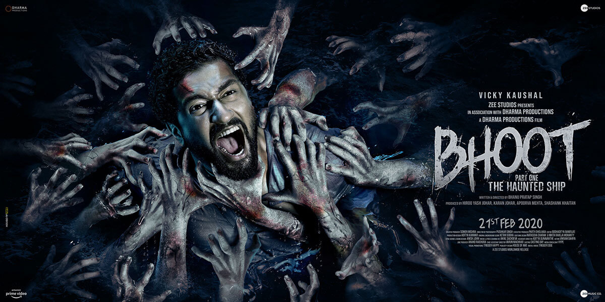
A brief of movie poster color schemes and their hidden meanings
These days, films are promoted using talk shows, celebrity cameos and social media campaigns. However, the significance of key art elements like beautifully designed movie posters, standees and theatrical posters for digital promotion still holds a significant place in the world of film marketing.
What do the different colour schemes of movie posters mean?
The answer to the above question is detailed in the following sections and has inputs from film poster designers in India associated with reputed key art studios in Mumbai.
Here goes –
Although movie studios in Mumbai have big budgets for film marketing, they often oversee the key art production process followed by expert graphic designers in Mumbai. This robs key art designers of their creative freedom as they are compelled to mimic the key art elements followed in movie posters of blockbuster films of the past.
What are the colour schemes predominantly used in Bollywood key art?
There are many. Some of the most common ones are mentioned in the sections below –
Blue and Orange hues
According to Hitesh Sharma of Hitesh Art – a revered designing studio associated with film poster design services in Mumbai,there is no written or unwritten rule that dictates the dominance of a particular colour during the creation process of key art elements.
Still, blue and orange are some of the most commonly used hues in key art elements for indie as well as big-budget films.
The reason is simple –
Blue and orange don’t ignite any cultural associations and they evoke warm and cold emotions in the human mind when it is exposed to key art created using these two colours.
White
Expert graphic designers in Mumbai often resort to using white as the dominant colour in key art elements intentionally or under the strict instruction of their clients when the marketing campaign is for a comedy film.
The reason is simple –
White is a colour that evokes light emotions in the human mind by conveying a friendly and understated message through key art.
Dark hues
Film artwork experts in India resort to using all variations of dark hues when the film that needs to be promoted belongs to any of the following genres –
- Action
- Thriller
- Horror
- Suspense or
- Science-fiction.
The reason is simple –
Most of the time, films belonging to the above genres are preferred by the young audience. Film studios fear that if they don’t use dark themed key art to promote their films then their audiences won’t take the movie seriously!
Dark hues evoke a sense of seriousness and also portray the message that the film is more ‘masculine’ and ideal for the mature audience segments.
It is a stupid idea but an idea nonetheless that performs well!
Conclusion
Key art designers appreciate the fact when they are allowed to create movie posters that break the monotony. According to veteran art director Hitesh Sharma, the CEO and founder of Hitesh Art – one of the leading key art studios in Mumbai, often, he and his team of key art experts in Mumbai, work on film promotion campaigns where they are given full authority over the design of key art elements. If you want to learn more about the recent projects headed by the reputed key art studio then contact the firm by calling 09664228598 / 7715996619 or by sending an email at hiteshsharma88@gmail.com.
